Arcadian Homes


Sometimes listings can vary from site to site forcing users to switch between websites to see every listing available, and this causes frustration. Scheduling tours can also be a hassle and could lead to someone not pursuing a home they’re interested in.
PROBLEM STATEMENT
Conception to delivery UX/UI Design, Research, Branding, Wireframing, & Prototyping
MY ROLE
January - April 2023
TIMELINE
SOLUTION
A one-stop-shop website where users can:
browse every listing available on one site.
access to everything they need in every step of the home-buying process.
view plenty of pictures for each available listing
schedule home tours with ease


RESEARCH
PAIN POINTS
Some listings may be on one website but missing from others, causing users to have to switch between sites to see everything available.
Scheduling tours can be more difficult for users causing frustration and leading to giving up.
Listings do not always have very many pictures of a property which makes it hard for users to know if they’d like to tour the home.
USER INTERVIEWS
I conducted unmoderated interviews with 5 people ranging from 24-45 years of age, each lasting 10-15 minutes.
Research Questions
What can I learn through a user’s flow through the website?
On average, how many tours are scheduled through the website each week?
Are there any elements that are confusing the users?
How long does it take a user to get through the tour scheduling process from the home page?
Can users easily navigate to parts of the website from the home page?
Questions:
How often do you look at listings online?
How many times have you moved?
Have you ever scheduled a home tour online before? If so, how many times?
Can you talk me through a normal day in your life?
Sounds good! If you’re ready, let's get to the tasks we’ll have you work on.
Script
PERSONA
Prompts
Sign in to your Arcadian Homes account.
How easy or difficult was this? Is there anything you would change about the process?
Prompt 2: Starting on the home page, find a home and click it. Can you tell me how many saves it has?
How easy or difficult was this? Is there anything you would change about the process?
Prompt 3: Pick any home again and schedule a home tour in person.
How easy or difficult was this? Is there anything you would change about the process?
Prompt 4: From the homepage, find the homes for rent. From the Homes for Rent page, navigate to the Homes for Sale.
How easy or difficult was this? Is there anything you would change about the process?
Prompt 5: How did you feel about Arcadian Homes website overall? What did you like and dislike about it?
Shay Foster

Age: 26 Education: Bachelor’s Degree Hometown: Charlotte, NC Family: Married Occupation: 911 Dispatcher
Goals
•Be able to see all available listings on one site
•Easily find listings based on specific criteria.
•Being able to see every room in the residence makes it so much easier to narrow down my options.
Frustrations
•“I don’t like having to switch between sites to see different listings."
•"I’d like to be able to see all of my options in one place."
•"It would be nice to be able to book a time a tour a home in the same place too."
SITEMAP


A primary pain point for users was having to switch between sites to see all available listings, so I used that knowledge to create a sitemap. My goal was to make information architecture decisions that would include all listing types as well as the overall ease of navigation.
USER JOURNEY MAP
I created a user journey map of Shay’s experience using the site to help identify possible pain points and possible improvements.
DEFINE
I sketched out paper wireframes for each screen, keeping in mind the users' pain points about listings, scheduling tours, and pictures. Because Arcadian Homes users access the site on different devices, I started to work on designs for mobile screens to ensure the site’s responsiveness.


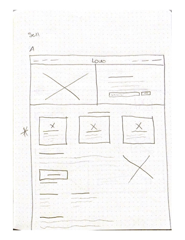


WIREFRAMES


LOW-FIDELITY PROTOTYPE

USABILITY STUDY
I conducted a usability study to get a better understanding of what users would like to see on their journey through the website. The study helped me make design decisions that would improve my high-fidelity prototypes.

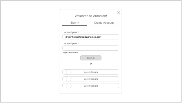
When testing on mobile devices, the “sign in” and “create” account buttons do not work.
The “add to bag” button is either not showing or does not make it clear that something was added.
There was some inconsistency in the call-to-action buttons.
ITERATIONS
My initial designs for the “Rental Listings” page caused some confusion on why the prices were sale prices. Also, once a user selected a date, they were forced to either stick with that date or start over if they changed their mind. I changed the prices on the page to show rental prices. In addition, I made the date selection for scheduling tours amendable.
Made the available, unavailable, and selected times more clear.


Not being able to change the date/time once selected caused frustraion.

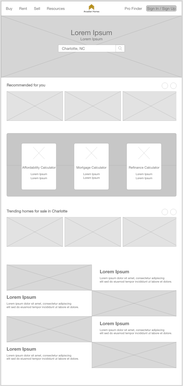
DESIGN SYSTEM

FINAL DESIGN


OTHER WORK
CONCLUSION + TAKEAWAYS
I learned that even a small and simple design change can make a huge impact on the user experience. My biggest takeaway from this project is to remember to focus on the users’ primary needs when coming up with designs to ensure the best experience possible.

The Sustained Company:
A responsive website and app for browsing and purchasing sustainable clothing from an ethical company.
Timeline:
April - May 2023
CASE STUDY 03


